
Paint colour decisions are more than a matter of taste. They influence mood, space perception, and overall harmony within a home. Whether you are selecting a new palette for a single room or coordinating colours throughout an entire house, colour theory offers practical tools for making choices that feel cohesive and intentional.
The Basics of Colour Theory

Colour theory involves the relationships between hues on the colour wheel. Primary colours (red, blue, and yellow) combine to form secondary colours (green, orange, and purple), and together they create tertiary colours. Understanding these relationships helps homeowners predict how colours will interact visually.
Complementary colours sit opposite each other on the colour wheel and create strong contrast when used together. Analogous colours are side by side and create more subtle transitions. A room with too many competing hues can feel disjointed, while a balanced palette built from complementary or analogous schemes brings unity to a space.
Warm vs. Cool Tones and Their Effects

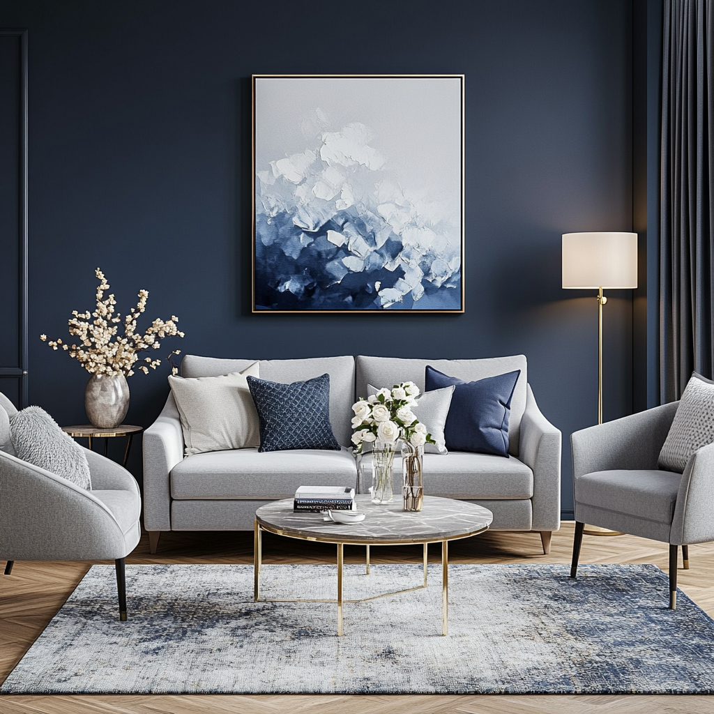
Colour temperature plays a critical role in how a room feels. Warm tones, such as reds, oranges, and yellows, tend to create an inviting and energized atmosphere. These shades are often used in social spaces like dining rooms and kitchens. Cool tones, including blues, greens, and purples, bring a calming and serene quality, making them popular for bedrooms and bathrooms.
The orientation of a room can also impact how colour is perceived. North-facing rooms tend to receive cooler light, which can intensify blue or green hues. South-facing spaces often benefit from warmer natural light, which softens cooler tones. Evaluating light conditions throughout the day is an important step before committing to a colour.
Using Neutrals as a Foundation

Neutral colours like beige, gray, white, and taupe provide a foundation that allows for flexibility. These shades work well as wall colours and can be paired with bolder accents. A common approach is to paint the majority of a room in a neutral tone and introduce colour through furnishings, artwork, or trim.
Not all neutrals are alike. Some have warm undertones, while others lean cool. Comparing paint swatches side by side can reveal subtle differences that may not be noticeable in isolation. Testing paint samples on walls and observing them at different times of day helps avoid surprises after painting is complete.
Considering Paint Finish and Durability
The finish of paint affects both appearance and practicality. Matte and flat finishes have low sheen and help conceal surface imperfections, but they can be harder to clean. Eggshell and satin finishes strike a balance between durability and aesthetics, making them popular for living areas and bedrooms. Semi-gloss and gloss finishes are easier to clean and are often used in kitchens, bathrooms, and on trim or cabinetry.
High-traffic areas benefit from paints that can withstand frequent cleaning. It is important to consider both the function of the space and the level of maintenance it will require. A colour that looks appealing on a swatch may perform differently on the wall if the finish does not suit the use of the room.
Getting It Right the First Time

Choosing paint for a home is both an aesthetic and practical decision. While trends can provide inspiration, the best results come from thoughtful planning that considers colour harmony, lighting, purpose, and finish. If you’re unsure, consult professional house painters, as they can bring both experience and technical knowledge to the process. Their guidance can help avoid costly mistakes and ensure the result aligns with the vision for the space.
A well-chosen colour palette contributes to the comfort and character of a home. Through a thoughtful application of colour theory and practical considerations, you can create spaces that reflect your style and support how you live.
For more information, take a look at the infographic below.


